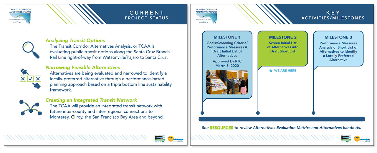
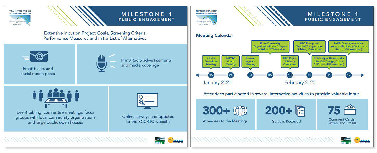
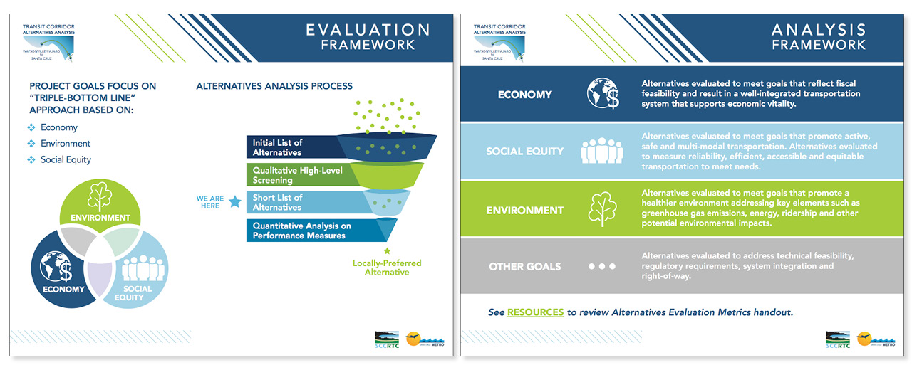
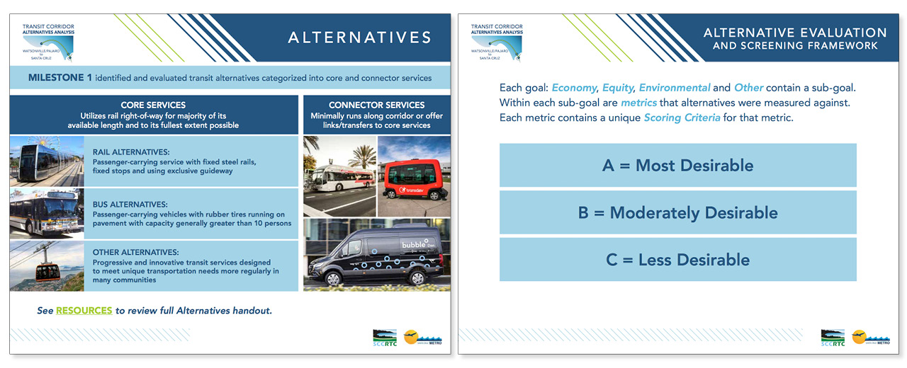
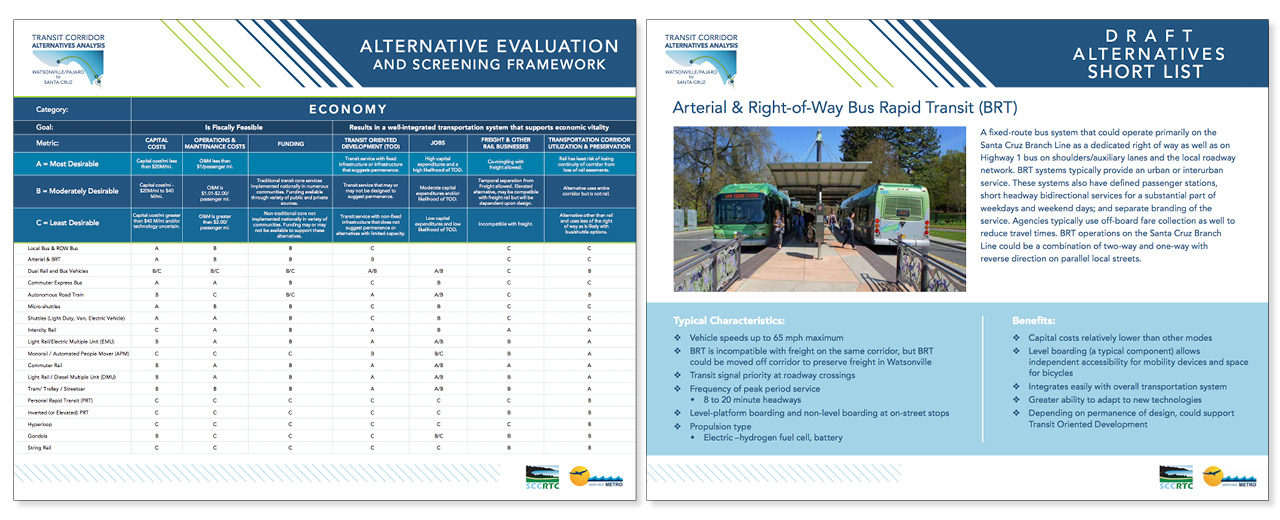
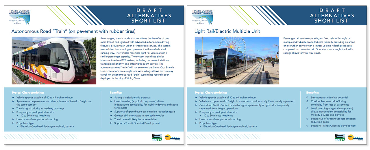
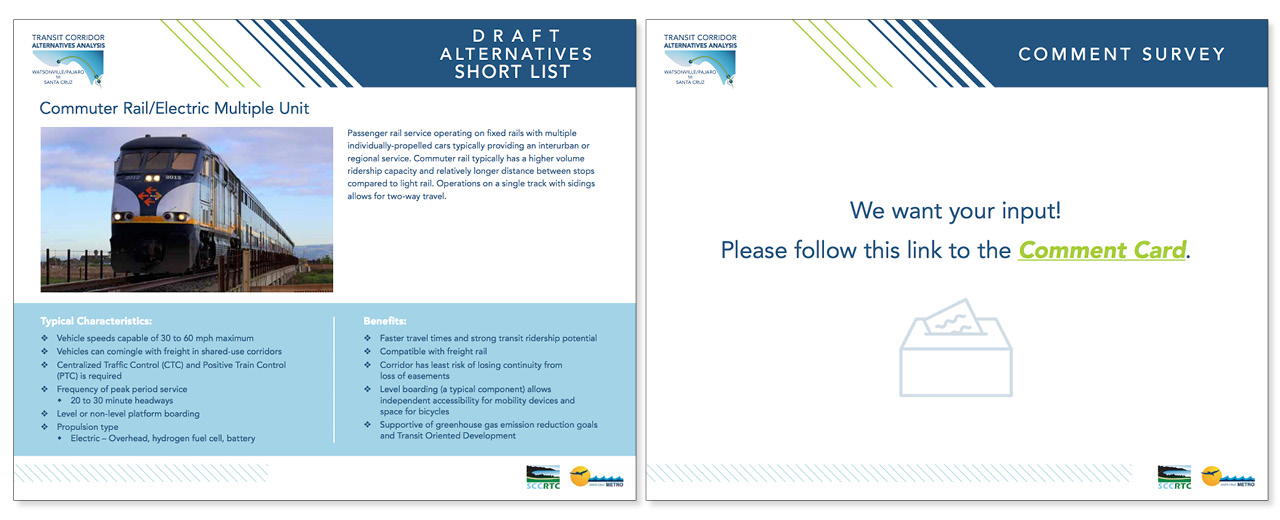
 This is an example of the type of work I did as a Graphic Designer at HDR. We had numerous public events we planned for and created materials to help us engage with our audience. We created meeting “boards” that we’d place on easels which stakeholders could approach and learn about upcoming projects that affected them. These boards corresponded with PowerPoint presentations which depicted nearly identical slides (we’d use the same graphics and content for both). Graphics that we would create for them include: infographics, iconography, timelines, milestones, maps, visual simulations, diagrams, charts, ADA compliant graphics, page layout elements, logo designs, branding and identity systems. Visual alternatives to plain text made it easier for people not familiar with the project details to absorb and process. We looked for opportunities to replace text with graphics wherever possible, and created visual storytelling elements to organize the flow of data.
One of my old bosses is hidden in one of these images, can you find her?
One activity we would apply to our meetings for better input would be sticky notes, and we would invite attendees to place votes, notes, or any kind of comment on the boards themselves. We’d collect the notes at the end of the event and use them in future events and presentations. In my opinion, one of the most effective ways to engage with your audience is to make your display or presentation more interactive.

